About
Hi, my name is Christian and I will be guiding you through my project. HiX is a grocery store chain that is focused on giving customers high-quality produce and durable, eco-conscious products at a reasonable price. Come join me as we dive deeper and I'll explain my thought process along the way.
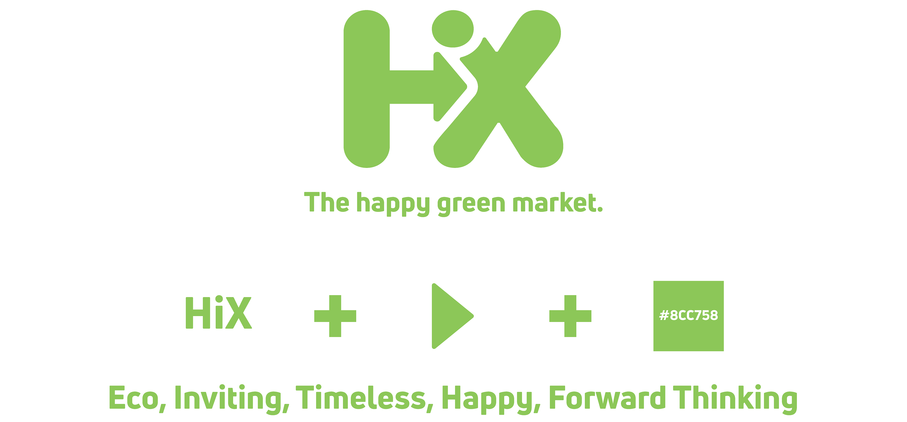
Logo

The HiX mark is a combination of things that imbue it with many feelings that I wanted to capture. First, we have the letters, they were chosen as a play on word of my last name Hicks. Second, we have the letters very close to one another, mainly the letter I, there is no I in a team but there is one in HiX meaning that individuals have the choice and opportunity to change the world for the better with the way they shop. Third, we have the arrow, I knew that I needed to have this somewhere in my logo because of the forward-thinking that this brand stands for. Fourth we have the color, it is a neutral green that has a balance of warm and cold tones showing the balance and growth of our brand. Lastly, the tagline "The happy green market" is easy to remember and fun to say while reflecting our values perfectly.
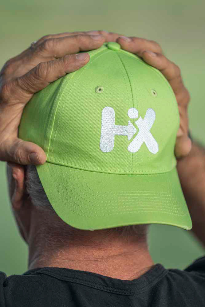
Hat
I chose this hat because it was the optimal green to not clash with the color of the t-shirt. The color itself is not very common and thus stands out in a good way. The stitching was chosen for using natural fibers and shows up well without using any extra embroidery effects. The logo sizing on the hat was to make the design more subdued and minimal, perfect for employees and customers to wear anywhere

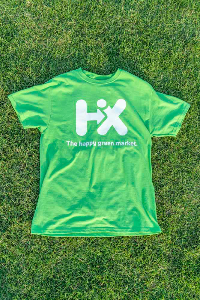
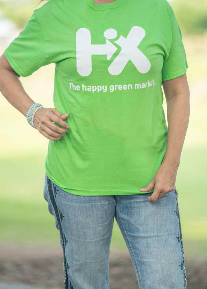
Shirt
For this t-shirt, I was able to find a printer that had the perfect color of shirts to match the hat and colors of my branding. While the design of the hat is more minimal, the shirt is designed to fully show the logo and tagline boldly as mainly staff will be wearing this on shift. Making sure customers can identify staff while strengthening the memory of the tagline is a perfect job for this shirt.
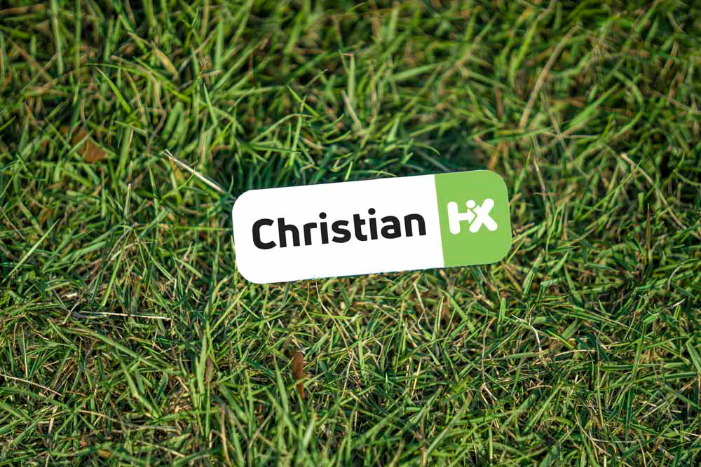
Nametag
The design decisions of this little but important piece of gear are explained as follows. First, the black text on a white background provides the maximum amount of contrast for the name of the employee, giving customers and staff alike to see the name from afar and identify who they are. While some businesses that use nametags include both the first and last name, I decided it would be best if only the first name was on there to be privacy conscious of our staff plus our less formal and minimal stylings. The equal sizing of the name and the logo was done to promote that the person comes first and is equally important to the cause that the brand stands for. Lastly, the tags have a magnetic backing that will ensure that they won't damage any shirt that is worn with it.
Business card
When designing these business cards I wanted two words to come to the minds of those that were handed one. The first-word trust is conveyed with the logo being prominently printed on the back of every card showing that every employee is an ambassador of the brand and as such will do their very best in business and service. The second word is eco-conscious, this is achieved with naturally sourced paper and inks that are less harmful to the environment compared to standard printing.


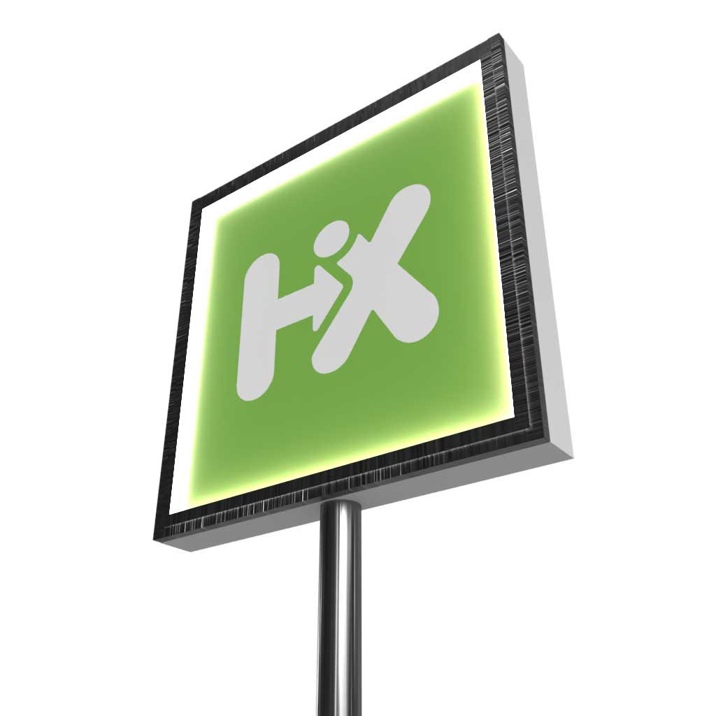
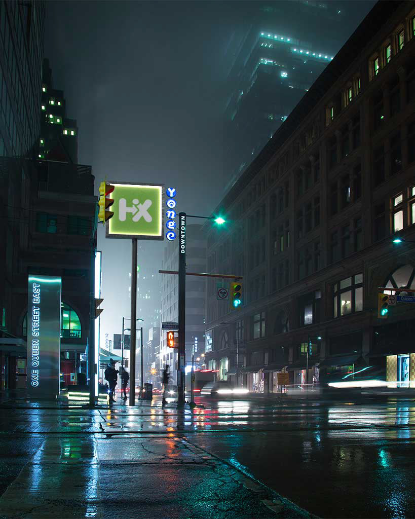
Store sign
This sign is designed to give proper luminance to the HiX logo while also cutting down on light pollution. The sign features the white on a green variant of the HiX logo giving a good indication that the happy green market is nearby.
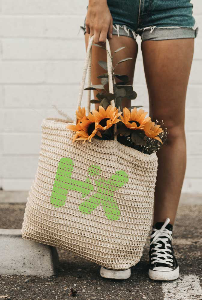
Reusable bag
When designing this bag I wanted something natural, washable, and durable. The breathable woven bag is great for carrying produce or other products. The branding is subtle and gives a very natural look to the one carrying it.

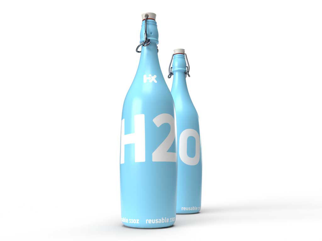
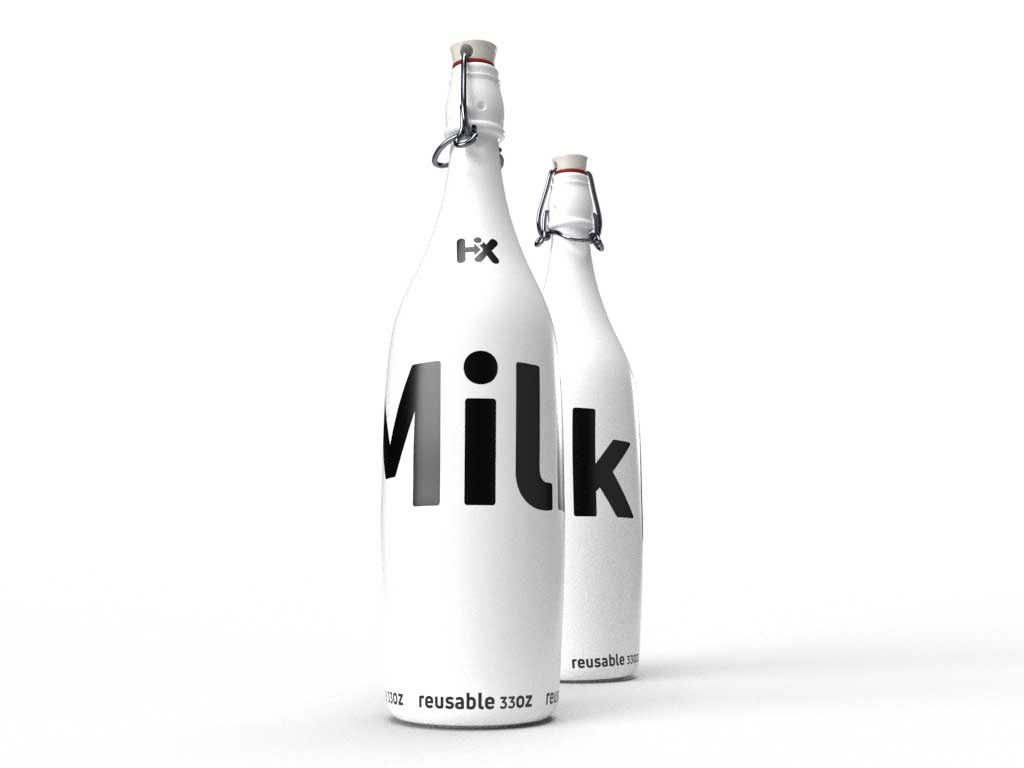
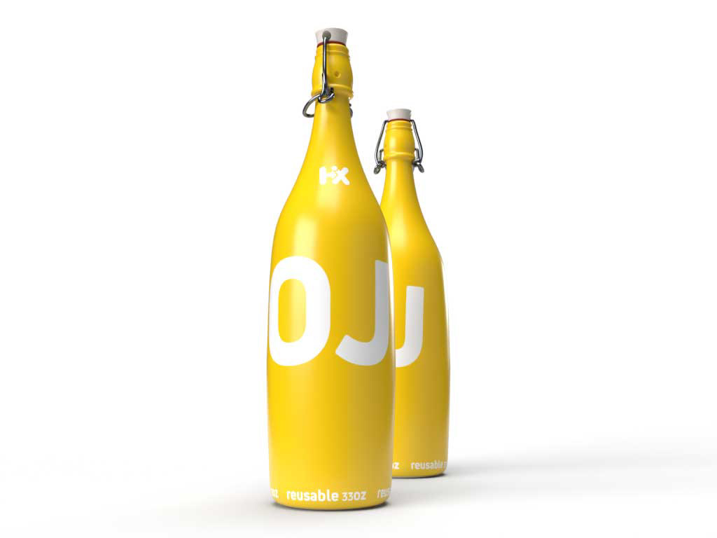
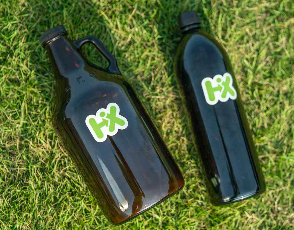
Bottled items
One of the many goals of HiX was to cut down on waste brought on by single-use plastics. The solution was to devise a system where customers would buy their product of choice in these glass containers, after consuming all of the product the customer would then return the bottles to the store where they would receive a small credit. Maintaining food safety practices these bottles would then be cleaned and disinfected before being reused again in the system. Currently, the designs shown here are some of the best selling products for this program, each one has a unique color that identifies what is inside of it without the customers having to read the label. These bold yet minimal brandings continue to build on the HiX clean and crisp design choices.
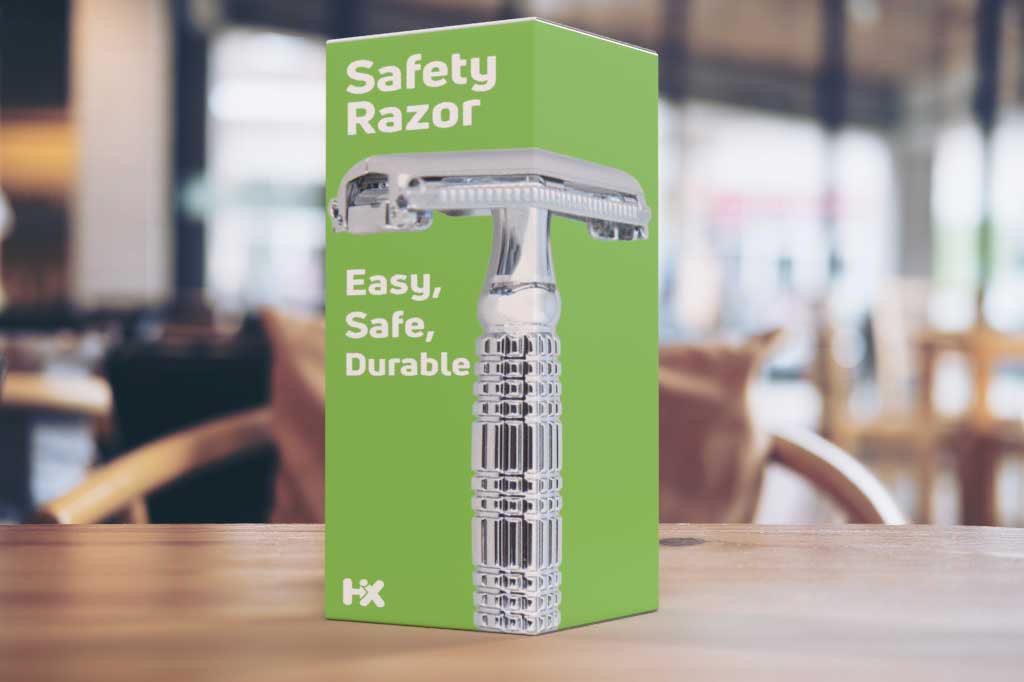
Safety razor
The safety razor is coming back to take the disposable market by storm. Not only are safety razors cheaper in the long run but their handles will last a lifetime of abuse. Matching the values of the product, the design of the packaging is straightforward and to the point. Combined with a minimal message and HiX green the product is appealing to all genders. The wraparound image of the product makes displaying the packaging an easy task.
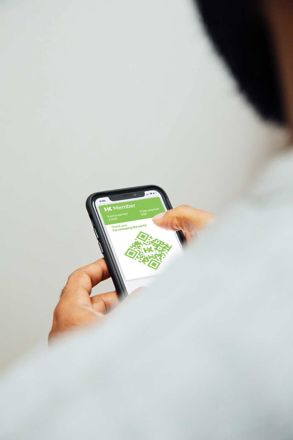
Member card
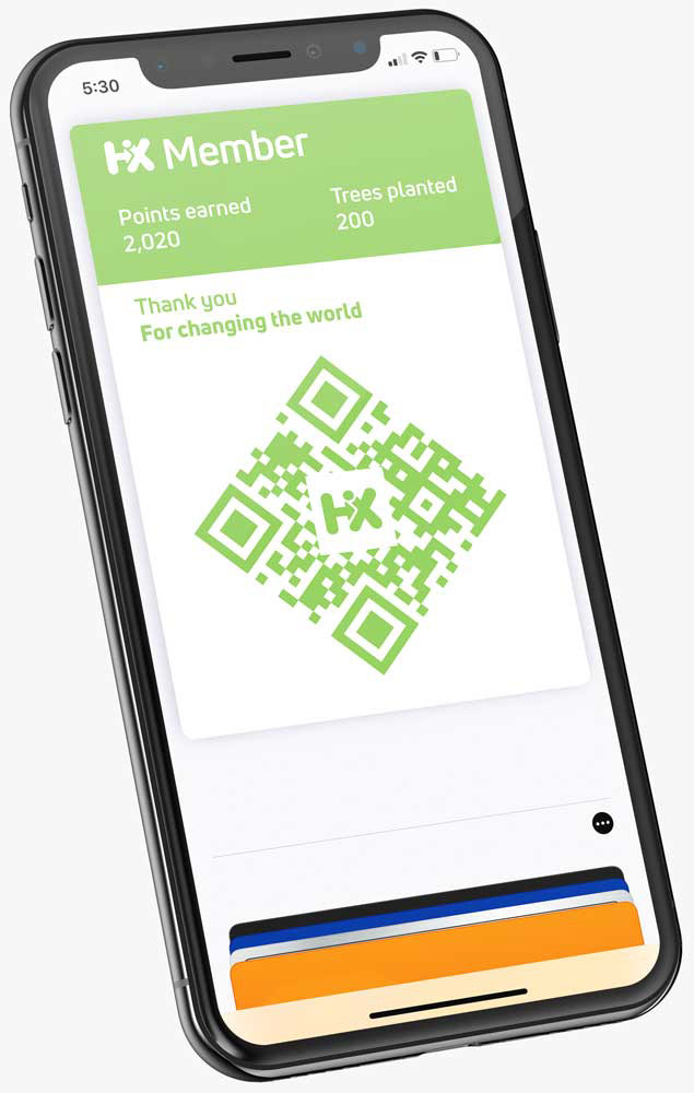
With the new age of technology we are now able to carry membership cards of our favorite brands right in our pocket, no longer will having a massive keyring full of plastic that will eventually wear or expire be required. Here at HiX, this was the perfect solution to our problem, we wanted to reward our customers by buying with us but we didn't want to contribute to plastic waste. These cards will be connected with a free app that will reward users with a planted tree with every $10 spent automatically. Included with the app is the ability to keep track of your credit from recycled items like our reusable bottles. Simply scanning the QR code will contribute to your membership.
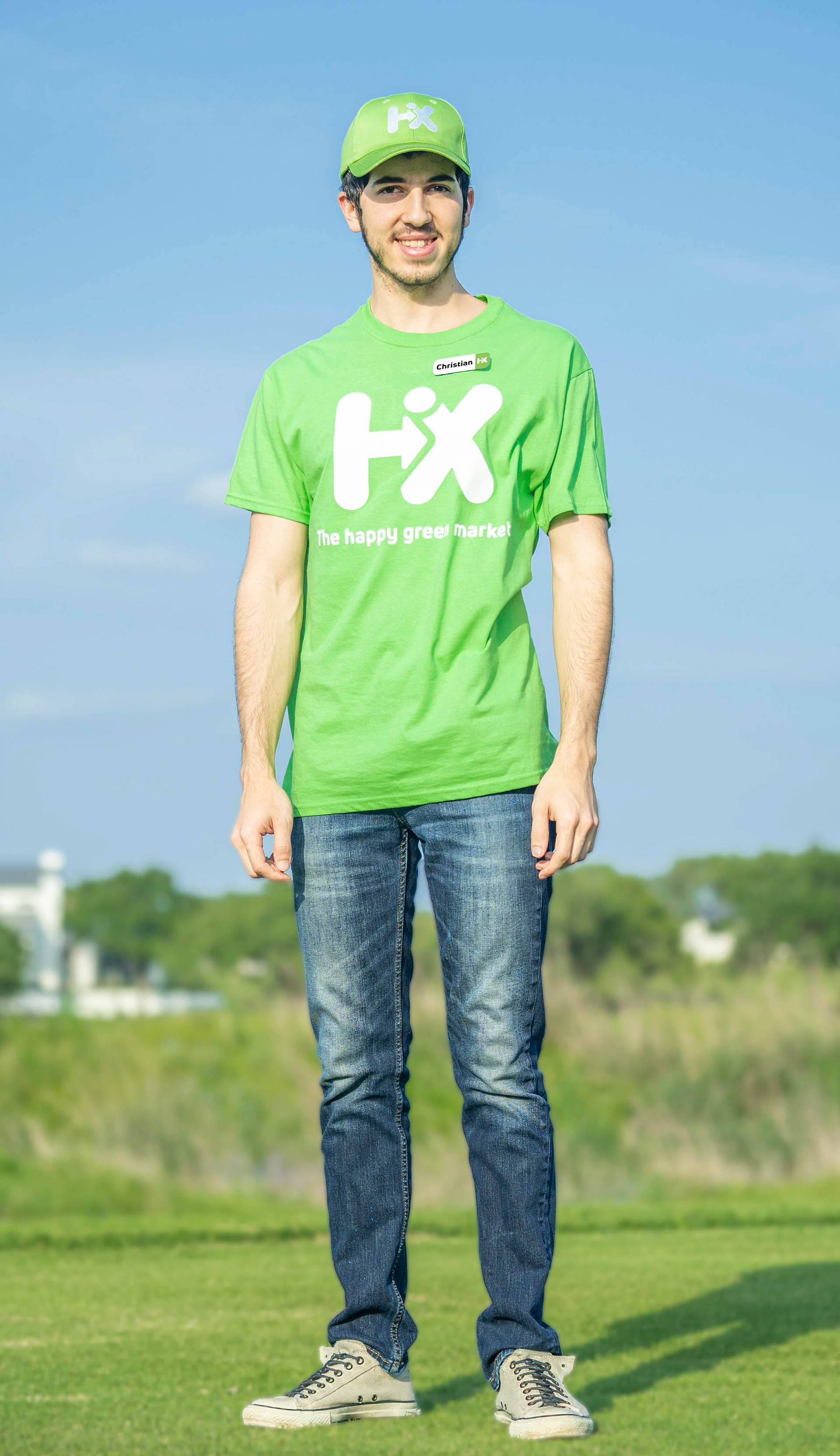
Employee wardrobe
Here we have the completed ensemble for what our employees wear daily. Starting from the top we have the HiX hat that is optional to wear, next we see the HiX shirt and nametag closing out the branded part of the wardrobe. For bottoms, the staff has the option to wear yoga pants or jeans in the colder months while shorts can be worn in the warmer months. Any type of shoes can be worn unless they work in an environment where they require close toe shoes, comfort and safety helps to keep our staff healthy and happy.
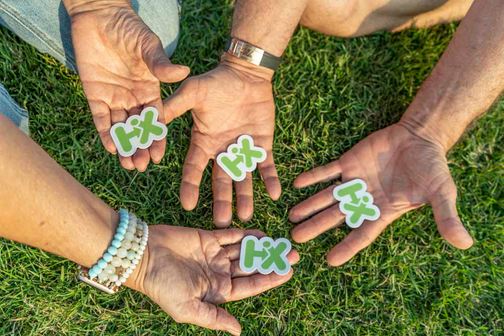
Stickers
These are probably my favorite part of this project. The sizing on the stickers is perfect for sticking on a phone case, slapping it on a computer, or apply it lovingly to your favorite reusable water bottle. The natural scalloped edges lead your eyes over the hills and into the valleys like you're going on a mini-adventure, of course where you'll be going is up to you.
Closing
So that's it, this project is over, my life studying at Schreiner University gave me the tools and knowledge with training to make this project what it is in front of you. Three-dimensional renders, mockups, photography, packaging, typography, logo design. This mark and this project are some of the best work that I have produced. Maybe down the line, this store becomes a reality and maybe will change the world.
Contact
If you want to get in contact with me the button below will send you to a contact form